

Apple’s Most Important Product Is Invisible
The most influential product created by Apple Inc. may not be the iPhone, the Mac, or the latest advances in spatial computing.
It is the user interface.

For decades Apple has pursued a simple but demanding idea. Technology should not feel complicated. It should feel natural. When a person unlocks an iPhone, scrolls through photos, edits a document on a Mac, or checks notifications on an Apple Watch, the interaction should feel instinctive.
This philosophy has shaped some of the most recognizable digital experiences in the world. Gestures such as swiping between screens, tapping icons to open apps, and pinching to zoom into images are now second nature for billions of people. Yet these interactions are the result of careful design decisions informed by psychology, ergonomics, and engineering.
Apple approaches the user interface as a discipline that bridges human behavior and computer systems. Designers study how people process information, how visual cues guide attention, and how motion communicates meaning. Engineers translate those insights into software frameworks that operate consistently across devices.
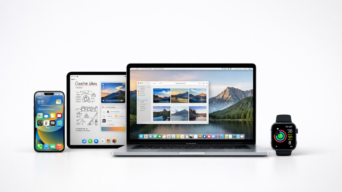
The result is a computing ecosystem where different products feel connected through a shared design language. Whether interacting with an iPhone, an iPad, a Mac, or an Apple Watch, users encounter familiar patterns and predictable behaviors.
Understanding the Apple user interface requires examining how this philosophy developed, how it guides Apple’s ecosystem today, and why it continues to influence the technology industry.
The Evolution of Apple’s Interface Design
Apple’s interface philosophy has evolved through several major technological shifts. Each stage reflects an effort to reduce the distance between human intent and machine response.
The Graphical Revolution
In 1984 Apple introduced the graphical user interface to a broader audience with the Macintosh. Instead of typing commands into a terminal, users interacted with windows, icons, and menus through a mouse.
This visual approach made computing more accessible. Files could be dragged into folders. Documents could be opened with a click. The interface translated complex computing concepts into simple visual metaphors.
For many people this was the moment when personal computing became approachable.
The Multi Touch Breakthrough
More than two decades later Apple reshaped interaction design again with the launch of the iPhone in 2007.
The iPhone removed physical keyboards and styluses and replaced them with a multi touch display. Users could tap, swipe, and pinch the screen directly. Digital content responded instantly to these gestures.
The experience felt closer to interacting with physical objects. Photos expanded under a pinch gesture. Lists moved with momentum as a finger flicked across the display.
These interactions quickly became the foundation of modern smartphone design.
Refinement and Modernization
Apple continued refining its interface philosophy with the introduction of iOS 7 in 2013. The update simplified visual elements and emphasized typography, spacing, and motion.
The redesign moved away from heavy visual textures toward a cleaner aesthetic that prioritized clarity and structure. Animations became an essential part of communicating how screens and elements relate to one another.
Today Apple’s design system spans multiple platforms including iOS, macOS, iPadOS, watchOS, and visionOS.
Despite the diversity of these platforms, the design philosophy remains consistent.
The Philosophy Behind Apple User Interface Design
Apple’s design system is guided by a framework known as the Human Interface Guidelines. These guidelines help designers and developers create applications that behave consistently across Apple platforms.
At the center of the framework are three principles. Clarity, deference, and depth.
Clarity
Clarity ensures that users can immediately understand what they are seeing and how to interact with it.
Apple achieves this through readable typography, clear iconography, and structured layouts. Interface elements communicate their purpose without requiring explanation.
This approach reduces cognitive load. Cognitive load refers to the mental effort required to understand how a system works. When an interface is clear, users can focus on their task rather than figuring out how the system behaves.
Deference
Deference ensures that the interface supports content rather than competing with it.
Photos, documents, and messages take visual priority. Navigation elements remain available but unobtrusive.
This philosophy explains the calm appearance of Apple interfaces. Instead of filling screens with controls, Apple prioritizes the information users care about most.
Depth
Depth uses motion and layering to communicate relationships between interface elements.
Animations provide context. When a screen expands from an icon or a panel slides into view, the motion helps users understand where they are within the system.
These visual transitions reinforce spatial awareness and strengthen the user’s mental model of the interface.
The Psychology Behind Intuitive Interfaces
Interface design sits at the intersection of psychology and engineering.
Human beings rely heavily on visual cues to interpret their environment. The brain processes patterns, movement, and hierarchy almost instantly. Apple’s design philosophy reflects this understanding.
Visual hierarchy directs attention toward important actions. Motion signals cause and effect relationships. Consistency reinforces memory.
For example, when users swipe down to refresh content in an app, they quickly learn to associate that gesture with updating information. The brain builds a mental shortcut. After a few interactions the gesture becomes automatic.
Apple invests heavily in studying how people respond to these cues. Designers test interfaces repeatedly to determine how users interpret animations, layouts, and interactions.
This psychological dimension is one reason Apple interfaces often feel intuitive even when users encounter them for the first time.
Designing for an Ecosystem
Apple does not design interfaces in isolation for each device. Instead it develops a shared interaction model that adapts to different hardware environments.
This approach allows users to move between devices without learning entirely new systems.
iPhone
The iPhone is built around direct touch interaction. Users manipulate digital objects using gestures such as tapping, swiping, and pinching.
This interaction model allows the device to feel immediate and responsive.
iPad
The iPad extends the touch interface while enabling more complex tasks. Larger screens support multitasking features such as split view and drag and drop interactions.
With stylus support through Apple Pencil, the iPad also enables creative workflows such as illustration and note taking.
Apple Watch
The Apple Watch focuses on glanceable interactions. Because the device is used briefly throughout the day, information must be quick to read and easy to act upon.
Notifications, health data, and quick actions are designed to deliver value within seconds.
Mac
Mac computers rely on pointer driven interaction through keyboards and trackpads. The interface supports professional workflows such as software development, video editing, and design.
Despite these differences, macOS maintains visual and behavioral consistency with Apple’s mobile platforms.
Vision Pro
Apple’s exploration of spatial computing introduces new possibilities for interface design. The Apple Vision Pro allows applications to appear as windows within a three dimensional environment.
Users interact with content through gaze, hand gestures, and voice commands. The design principles guiding these interactions remain rooted in clarity, hierarchy, and intuitive feedback.
Core Elements of Apple User Interface Design
Several design components contribute to the experience associated with Apple devices.
Gesture Based Interaction
Gestures allow users to manipulate digital objects in ways that resemble physical actions. Swiping through pages or pinching to zoom creates a sense of direct interaction with content.
Visual Hierarchy
Apple structures information using typography, spacing, and layout. Important elements are visually emphasized while secondary information remains subtle.
This hierarchy helps users navigate complex interfaces with ease.
Motion and Animation
Animations communicate meaning rather than decoration. Transitions illustrate how screens relate to one another and how actions affect the system.
These cues maintain continuity as users move through applications.
Iconography
Icons serve as visual shortcuts that represent common functions. Apple maintains strict guidelines for icon design so that symbols remain recognizable across the system.
Consistency
Consistency across apps and devices reduces the learning curve for users. When familiar interaction patterns repeat throughout the ecosystem, users build confidence in the system.
Hardware and Software Working Together
One of Apple’s greatest advantages lies in its control over both hardware and software.
Many technology companies rely on external suppliers for processors or operating systems. Apple designs key components of its technology stack internally. This includes custom processors such as the Apple M3 family used in modern Mac computers.
Because Apple controls both hardware and software, engineers can optimize performance and responsiveness. Animations render smoothly, touch input responds instantly, and system resources are allocated efficiently.
This vertical integration allows Apple to deliver a cohesive experience across its ecosystem.
Apple UI and Industry Influence
Apple’s approach to interface design has influenced the entire technology industry.
Interaction patterns popularized by Apple are now common across smartphones, tablets, and computers. Multi touch gestures, fluid animations, and simplified icon based navigation have become standard elements of modern software design.
Operating systems developed by other companies have adopted similar principles in order to deliver intuitive user experiences.
The influence extends beyond smartphones. Many modern applications on desktop platforms also reflect Apple’s emphasis on clarity, motion, and visual hierarchy.
Apple and Android Design Philosophies
Apple’s interface philosophy differs significantly from that of the Android ecosystem developed by Google.
Google’s design framework, known as Material Design, emphasizes adaptability and customization. Android device manufacturers such as Samsung Electronics and Xiaomi often modify the interface to differentiate their products.
This openness encourages experimentation and flexibility.
Apple follows a more controlled approach. Developers are encouraged to follow the Human Interface Guidelines so that applications remain consistent across the ecosystem.
The result is a platform where interactions feel predictable regardless of which application a user opens.
Looking Toward the Future
Computing continues to evolve as new technologies emerge.
Artificial intelligence, contextual computing, and spatial interfaces are shaping the next generation of digital experiences. Devices are beginning to respond to voice commands, environmental signals, and user behavior in increasingly sophisticated ways.
Apple’s exploration of spatial computing suggests a future where digital information blends seamlessly with physical surroundings. Instead of interacting solely through screens, users may engage with content through gestures, voice, and gaze.
As these technologies mature, the principles guiding Apple’s interface design remain relevant. Clarity helps users understand complex systems. Deference ensures that content remains central. Depth provides context in both two dimensional and spatial environments.
Closing Perspective
Across decades of technological change, Apple has remained focused on a single objective. Technology should empower people without overwhelming them.
Through thoughtful interface design, Apple has transformed complex computing systems into tools that feel approachable and intuitive. The gestures that move across a screen, the animations that guide navigation, and the consistency that ties devices together all reflect careful attention to how people interact with machines.
What appears simple on the surface is the result of years of design exploration and engineering precision. Behind every swipe, tap, and transition lies a philosophy that continues to shape modern computing.
When the interface succeeds in its purpose, it fades into the background and allows the user to focus entirely on the task at hand.